Definition of the Olympic rings
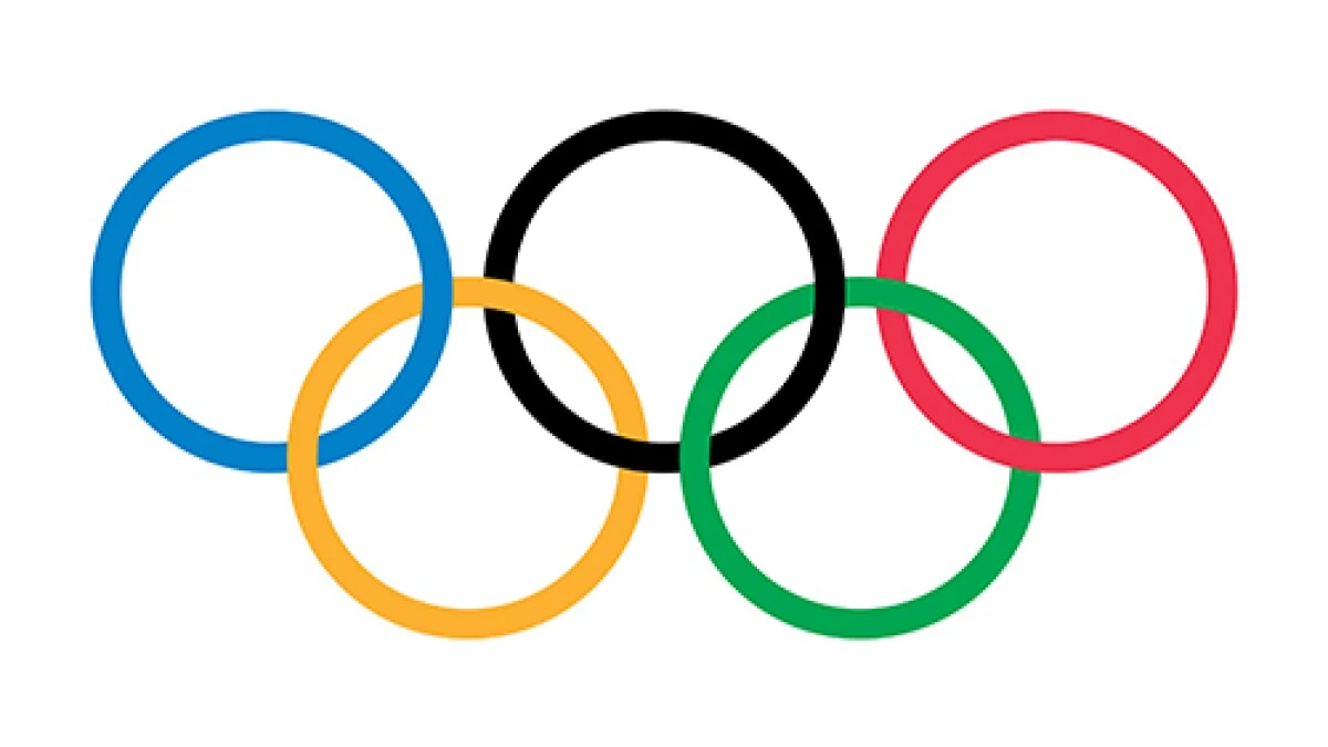
The Olympic symbol consists of five interlaced rings of equal dimensions (the Olympic rings), used alone, in one or in five different colours. When used in its five-colour version, these colours shall be, from left to right, blue, yellow, black, green and red. The rings are interlaced from left to right; the blue, black and red rings are situated at the top, the yellow and green rings at the bottom in accordance with the following graphic reproduction.
— (Olympic Charter, Ru le 8)

Meaning of the Olympic rings
The Olympic symbol expresses the activity of the Olympic Movement and represents the union of the five continents and the meeting of athletes from throughout the world at the Olympic Games.
— (Olympic Charter, Rule 8)
“These five rings represent the five parts of the world now won over to the cause of olympism and ready to accept its fecund rivalries. What is more, the six colors thus combined reproduce those of all nations without exception.“
Pierre de Coubertin | Founder fo the Olympic Movement
Key facts about the Olympic Games logo
- Origin: The Olympic Games logo, consisting of five interlocking rings, was designed by Pierre de Coubertin, the founder of the modern Olympic Games.
- Introduction: The logo was officially introduced in 1913 at the 20th anniversary of the International Olympic Committee (IOC).
- Symbolism: The five rings represent the union of the five continents and the meeting of athletes from around the world at the Olympic Games. Each ring is colored blue, yellow, black, green, and red, respectively.
- Universal Representation: The colors of the rings were chosen because at least one of them appeared on the flag of every nation at the time of its creation, ensuring that each country would be represented in the emblem.
- Meaning: The Olympic Rings symbolize the unity, friendship, and competition inherent in the Olympic movement. They serve as a powerful reminder of the shared values and aspirations of the Olympic Games.
- Trademark: The Olympic Rings logo is one of the most recognizable symbols in the world and is protected by trademark laws. It can only be used under license from the International Olympic Committee (IOC) for approved purposes.
- Versatility: The logo is used extensively in promotional materials, merchandise, and branding associated with the Olympics, including the Games’ official website, signage, apparel, and broadcasting.
- Evolution: While the basic design of the Olympic Rings has remained consistent since its creation, there have been occasional modifications to its presentation, such as variations in color gradients and shading, to adapt to different media and design trends.
- Legacy: The Olympic Rings logo has transcended its original purpose as a sporting emblem and has become a universal symbol of international cooperation, athletic excellence, and the pursuit of peace through sport.
Backgrounds of the logos for the last 10 Olympic Games
here’s a brief overview of the backgrounds of the logos for the last 10 Olympic Games:
- Rio 2016 Olympics: The logo for the 2016 Olympics in Rio de Janeiro, Brazil, featured a colorful design inspired by Brazil’s vibrant culture, nature, and the iconic Sugarloaf Mountain.
- London 2012 Olympics: The logo for the 2012 Olympics held in London, UK, was a bold, modern design featuring the numbers “2012” stylized to resemble the shape of athletes in motion. It aimed to reflect the energy and diversity of London.
- Beijing 2008 Olympics: The logo for the 2008 Olympics in Beijing, China, was known as the “Dancing Beijing” logo. It depicted a stylized athlete in motion, inspired by the Chinese character for “jing,” which means capital.
- Athens 2004 Olympics: The logo for the 2004 Olympics in Athens, Greece, featured an olive wreath, a symbol of peace and victory in ancient Greece, surrounding the Olympic rings. The design aimed to evoke the spirit of the ancient Olympic Games.
- Sydney 2000 Olympics: The logo for the 2000 Olympics in Sydney, Australia, featured a stylized representation of the Sydney Opera House and the Olympic rings, with a wavy design symbolizing the harbor and waves of the sea.
- Atlanta 1996 Olympics: The logo for the 1996 Olympics in Atlanta, USA, featured a stylized flame atop a blue background, with the Olympic rings below. The flame represented the Olympic torch and the spirit of competition.
- Barcelona 1992 Olympics: The logo for the 1992 Olympics in Barcelona, Spain, featured a stylized, abstract design known as the “Mediterranean flower.” It was inspired by the colors and shapes of the Mediterranean region.
- Seoul 1988 Olympics: The logo for the 1988 Olympics in Seoul, South Korea, featured a stylized image of a flying pigeon, known as “Hodori,” the official mascot of the Seoul Olympics. It symbolized peace and harmony.
- Los Angeles 1984 Olympics: The logo for the 1984 Olympics in Los Angeles, USA, featured a stylized image of the Olympic torch, with a flame that formed the shape of a starburst. It reflected the energy and excitement of the Games.
- Moscow 1980 Olympics: The logo for the 1980 Olympics in Moscow, USSR (now Russia), featured a stylized image of a running athlete holding a torch, with the Olympic rings above. It aimed to symbolize the spirit of competition and athleticism.


